Tutorial
Rebuilding Opal's Amazing Scroll Animations With Modern CSS Techniques
Opal made an amazing looking website, we're gonna spice it up even more by using scroll-driven animations!
123456789101112131415161718192021222324252627282930313233343536373839404142434445464748495051525354555657585960616263646566676869707172737475767778798081828384858687888990919293949596979899100101102103104105106107108109110111112113114115116117118119120121122123124125126import "./index.css";
import { twMerge } from "tailwind-merge";
type ParallaxImageProps = {
smallImage: string;
largeImage: string;
smallImageSide: "left" | "right";
parallaxDistance: string;
};
const ParallaxImage = ({
smallImage,
largeImage,
smallImageSide,
parallaxDistance,
}: ParallaxImageProps) => {
return (
<div
className={twMerge(
"col-[wide] my-20 grid gap-3 [view-timeline-name:--parallax-wrapper]",
smallImageSide === "left"
? "md:grid-cols-[1fr_2fr]"
: "md:grid-cols-[2fr_1fr]",
)}
>
<div className="self-start">
<div
className="md:supports-[animation-timeline]:parallax-image relative"
style={{ "--movement": parallaxDistance } as React.CSSProperties}
>
<div className="absolute bottom-full pb-5 text-[8px] uppercase">
<p>Teenie-tiny.</p>
<p className="text-gray-400">
The Tadpole is just a tad taller than a gummy bear. It fits in
your hand and rests nicely on your laptop display.
</p>
</div>
<img src={smallImage} className="rounded-md" />
</div>
</div>
<img
src={largeImage}
className={twMerge(
"rounded-md",
smallImageSide === "right" && "md:-order-1",
)}
/>
</div>
);
};
function App() {
return (
<main className="wrapper">
<div className="full-bleed relative z-10 flex h-screen items-center bg-zinc-800 bg-[url(/img/opal-rebuild/hero-tadpole.webp)] bg-cover bg-center pb-20">
<div className="mx-auto w-full max-w-5xl px-2 md:px-4">
<h2 className="text-2xl text-white md:text-4xl">
A new species
<br /> of webcam
</h2>
</div>
</div>
<div className="mt-[-100vh] h-[400vh] [view-timeline-name:--reveal-wrapper]">
<div className="sticky top-0 flex min-h-screen items-center justify-center">
<div>
<p className="supports-[animation-timeline]:reveal-text text-xl text-black md:text-4xl lg:text-[60px] lg:leading-[1]">
Introducing the Tadpole the smallest webcam ever built. With a
category-first directional microphone, a mirrorless Sony sensor,
and the easiest way to mute your call with a tap it’s the perfect
webcam to take with you everywhere
</p>
</div>
</div>
</div>
<ParallaxImage
smallImage="/img/opal-rebuild/image-1.webp"
largeImage="/img/opal-rebuild/image-2.webp"
smallImageSide="left"
parallaxDistance="100%"
/>
<ParallaxImage
smallImage="/img/opal-rebuild/image-1.webp"
largeImage="/img/opal-rebuild/image-2.webp"
smallImageSide="right"
parallaxDistance="100%"
/>
<div className="full-bleed flex h-screen items-center justify-center bg-gray-100 px-4 text-lg md:text-2xl">
<div className="max-w-[800px] space-y-3">
<p>
This is a rebuild by{" "}
<a
href="https://www.frontend.fyi"
target="_blank"
className="underline"
>
Frontend.FYI
</a>
, rebuilding the{" "}
<a
href="https://opalcamera.com/opal-tadpole"
target="_blank"
className="underline"
>
Opal Tadpole
</a>{" "}
animations with modern CSS techniques. This website is in no way
related to Opal. Their design is only used as an inspiration to
teach frontend development.
</p>
<p>
All images are taken from Opal's Press kit, and remain copyrighted
by Opal.
</p>
</div>
</div>
</main>
);
}
export default App;
In this rebuild we will be taking a look at the marketing page for Opal’s newest product: Tadpole. This page is full of amazing scroll animations, bringing the page to life as you scroll down. These animations are able to demonstrate the different product features in a fun and engaging way.
In this video we won’t be simply rebuilding these animations, but we’re throwing a modern CSS technqiue into the mix: Scroll-driven animations! Unsure what they are? Make sure to check out my earlier video showing a very basic implementation of them: CSS Scroll-Driven Animations — We Don’t Need Any JS!.
What we’ll be building
In this article we will be mainly focussing on the first animation created in the video, the text reveal animation. Make sure to check out the full video for more scroll-driven animations!
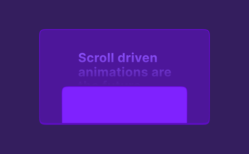
Text reveal animation
The animation we are going to recreate in this article, is the text reveal animation below. As you scroll down, the text will slowly reveal itself, until it’s fully visible.
There are two major elements you need to understand in order to create this animation.
CSS Background Clip: Text
With CSS background-clip: text your are able to clip the background of an element to the text inside of it. If you combine this with a transparent text color, you can give the text a color by setting a background color.
.fancy-text { background-color: #ff0000; background-clip: text; color: transparent;}Fancy text
So far lots of complexity for little result right? However, the nice thing with backgrounds compared to text colors, is you can use gradients to create multiple backgrounds!
Let’s use a background image instead of a color, so we can add a gradient.
.fancy-text { background-image: /* A green to red gradient */ linear-gradient(to right, #00ff00, #ff0000 50%, transparent 50%) /* A blue to yellow gradient */ linear-gradient(to right, transparent 50%, #0000ff 50%, #ff0); background-clip: text; color: transparent;}Fancy text
And look at that, suddenly you see two gradients appear! The reason you see two now, is because the first gradient becomes transparent at 50%, and the second gradient is transparent for the first 50%.
But why even use two gradients? We can even do it with one!
.fancy-text { background-image: /* A green to red gradient */ linear-gradient(to right, #00ff00, #ff0000 50%, #0000ff 50%, #ff0); background-clip: text; color: transparent;}Fancy text
By ensuring the overlap of the two colors is both at 50%, it’s not a gradient in the middle, but rather a hard cut.
Now how can we use this for a text reveal?
Instead of fading the gradient from one color to another, we make a gradient that goes from and to the same color.
.fancy-text { background-image: linear-gradient(to right, #fff, #fff 30%, #aaff 30%, #aaff); background-clip: text; color: transparent;}Fancy text
Now we have a gradient that instead of being a real gradient, is essentially two colors divided at a specific point: 30% here.
Let’s turn the 30% into a variable so we can play with it’s position.
.fancy-text { --split-position: 30%; background-image: linear-gradient(to right, #fff, #fff var(--split-position), #aaff var(--split-position), #aaff); background-clip: text; color: transparent;}Fancy text
What if a text spans multiple lines?
Ah, good question – I thought you’d never ask!
The solution might be easier than you think: Make your element display: inline. This stops the element from being a single “block”, and turns it into a multi line element, where the background also spans multiple lines. Take a look at the examle below and toggle the display property to see the difference.
Introducing the Tadpole the smallest webcam ever built. With a category-first directional microphone, a mirrorless Sony sensor, and the easiest way to mute your call with a tap it’s the perfect webcam to take with you everywhere
Time to add the scroll interaction
Now we know how we can give a text element two colors, it’s finally time to add the scroll interaction to it.
The basis of scroll-driven animations are regular CSS Animations. The only difference is that you only have to define an end position for your animation.
@keyframes text-reveal { to { --split-position: 100%; }}Since we are animation a CSS variable here instead of a regular property (like transform), we need to take one extra step.
We need to tell the browser what the type of our variable is. Is it a string, a number, a color, or a percentage? With CSS custom properties you do this by using the @property rule:
@property --split-position { syntax: "<percentage>"; inherits: false; initial-value: 0%;}Now the browser knows what type the variable is, it is also able to animate it in this case from 0% to 100%. Let’s combine all of this and add the animation to our element:
@keyframes text-reveal { to { --split-position: 100%; }}
@property --split-position { syntax: "<percentage>"; inherits: false; initial-value: 0%;}
.fancy-text { --split-position: 0%; animation: text-reveal 1s ease-in-out; background-image: linear-gradient( to right, #fff, #fff var(--split-position), #aaff var(--split-position), #aaff ); background-clip: text; color: transparent; display: inline;
/* The only new line: the animation. */ animation: text-reveal linear both;}This single line won’t connect the animation to the scroll position just yet though. It will now run your animation immediately on page load.
Let’s introduce two new CSS properties:
animation-timeline: --reveal-wrapper;animation-range: entry 0% cover 80%;animation-timeline takes a CSS variable as a value. When passing this, the browser expects any parent of this element to have this CSS variable defined as view-timeline-name: --reveal-wrapper. It will then use this element as the timeline for the animation.
Defining the animation timeline
Sounds confusing? Let’s take a look at this example. By setting the view-timeline-name on the scroll-wrapper and giving it a height of 300vh, we have a 300vh distance to scroll, over which we animate the element’s scale.
The scrolling-text div stays in view because it has a position sticky.
Finally the animation-range property can be used to define the exact range of the animation. Make sure to check MDNs docs on animation-range to learn more about all its options.
123456789import "./styles.css";
export default function App() {
return (
<div className="scroll-wrapper">
<div className="scrolling-text">👀</div>
</div>
);
}Combining everything
Now we also learned how to connect this animation to the scroll position, let’s combine everything into a single text reveal animation.
123456789import "./styles.css";
export default function App() {
return (
<div className="scroll-wrapper">
<div className="fancy-text">Introducing the Tadpole the smallest webcam ever built. With a category-first directional microphone, a mirrorless Sony sensor, and the easiest way to mute your call with a tap it’s the perfect webcam to take with you everywhere</div>
</div>
);
}And with that, we created a modern approach to a text reveal animation, that is completely scroll-driven and doesn’t require any JavaScript! This used to be so much more complicated back in the days, when we did need JavaScript for these things.
Don’t forget to check out the video if you want to learn more about how I recreated the full demo at the top of this article!
Finally, I want to give a shoutout to Bramus for his website showing many great use cases for scroll-driven animations: scroll-driven-animations.style. Make sure to check it out for more inspiration!
Eager to learn more?
I think this video might be a good fit for you too!