123456789101112131415161718192021222324252627282930313233343536373839404142434445464748495051525354555657585960616263646566676869707172737475767778798081828384858687888990919293949596979899100101102103104105106107108109110111112import { useRef } from "react";
import "./index.css";
import { VisaIcon } from "./visa";
function App() {
const dialogRef = useRef<HTMLDialogElement>(null);
return (
<div className="w-5xl mx-auto mt-24 max-w-[90%]">
<h1 className="text-3xl font-medium">Billing details</h1>
<div className="mt-4 flex flex-col rounded-2xl bg-gray-900 p-8 text-xl text-white">
<p>Premium plan</p>
<p className="text-sm">Your plan renews on 01/01/2024</p>
<div className="mt-4 flex items-center gap-3 self-start rounded-2xl bg-gray-800 px-4 py-8">
<div className="w-20 rounded-xl bg-white px-3 py-1">
<VisaIcon />
</div>
<div>•••• •••• •••• 1234</div>
<button
onClick={() => dialogRef?.current?.showModal()}
className="ml-8 rounded-md bg-gray-600 px-4 py-2 text-sm text-white transition-colors hover:bg-gray-700"
>
Change payment method
</button>
</div>
</div>
<dialog
ref={dialogRef}
onSubmit={(ev) => {
const formData = new FormData(ev.target as HTMLFormElement);
console.log(formData.get("card-number"));
}}
onClick={(ev) => {
const target = ev.target as HTMLDialogElement;
if (target.nodeName === "DIALOG") {
target.close();
}
}}
onClose={(ev) => {
const target = ev.target as HTMLDialogElement;
console.log(target.returnValue);
}}
className="text-md inset-0 block w-2/3 translate-y-20 rounded-2xl p-0 opacity-0
transition-[opacity,transform] duration-300 backdrop:backdrop-blur-sm
[&:not([open])]:pointer-events-none [&[open]]:translate-y-0 [&[open]]:opacity-100"
>
<form method="dialog">
<header className="relative rounded-t-2xl bg-white px-8 pt-6">
<h1 className="text-2xl font-bold">Change your payment method</h1>
<button
type="button"
onClick={() => dialogRef?.current?.close()}
className="absolute right-4 top-4 flex h-8 w-8 items-center justify-center rounded-md bg-gray-100 p-3 text-xl"
>
<span className="sr-only">close</span> ×
</button>
</header>
<main className="space-y-3 bg-white px-8 py-16">
<div className="flex items-center">
<label className="mr-auto w-1/3 text-gray-400">Card number</label>
<input
className="w-full rounded-lg border px-3 py-2"
type="text"
name="card-number"
/>
</div>
<div className="flex items-center">
<label className="mr-auto w-1/3 text-gray-400">Expiration</label>
<input
className="w-full rounded-lg border px-3 py-2"
type="text"
name="expiration"
/>
</div>
<div className="flex items-center">
<label className="mr-auto w-1/3 text-gray-400">CVC</label>
<input
className="w-full rounded-lg border px-3 py-2"
type="password"
name="cvc"
placeholder="•••"
/>
</div>
</main>
<footer className="flex justify-end gap-6 rounded-b-2xl bg-gray-100 px-8 py-4">
<button
className="text-gray-400"
formMethod="dialog"
value="cancel"
>
Cancel
</button>
<button
className="rounded-xl bg-blue-500 px-5 py-3 text-white shadow-md transition-colors hover:bg-blue-600"
formMethod="dialog"
value="submit"
>
Save changes
</button>
</footer>
</form>
</dialog>
</div>
);
}
export default App;
<div className="text-md rounded-2xl"></div>Background
Are you still building dialogs/modals using custom components? The HTML dialog element is now supported in all major browsers and it offers excellent accessibility features right out of the box. Adding a modal to your page has never been easier. Let’s see how we can integrate it into our page.
Adding the dialog element
Let’s dive right in by adding the dialog element. Just below the billing details container, you’ll find another div that wraps the form. We’re going to replace this div with the new dialog element.
<div className="text-md rounded-2xl"></div>Becomes (don’t forget the closing tag after the form):
<dialog className="text-md rounded-2xl"></dialog>After adding the dialog element, you may notice that it disappears from the page.
This is because dialogs are not visible by default. You can make it visible by adding the
open attribute to the dialog. Once you add the open attribute, the dialog should appear again.
It still won’t be overlaying all of you content though.
Making the dialog overlay the content
It’s not recommended to manually toggle the open attribute.
Instead, we have to use a little bit of JavaScript to toggle the dialog.
To access the DOM element and execute the required method, we need to add a reference (ref)
to the dialog element since we’re working with React.
import { useRef } from "react";//..
function App() { const dialogRef = useRef(null);
return ( <div className="w-5xl mx-auto mt-24 max-w-[90%]"> {/* rest of the billing details */} <button className="ml-8 rounded-md bg-gray-600 px-4 py-2 text-sm text-white transition-colors hover:bg-gray-700"> Change payment method </button> <dialog ref={dialogRef} className="text-md rounded-2xl"> {/* Dialog here */} </dialog> </div> );}After setting the ref on the dialog element, we now have access to the DOM element.
This element has a method showModal() which we can call to show the modal. Let’s add that function in the onClick handler of our button.
import { useRef } from "react";//..
function App() { const dialogRef = useRef(null);
return ( <div className="w-5xl mx-auto mt-24 max-w-[90%]"> {/* rest of the billing details */} <button onClick={() => dialogRef?.current?.showModal()} className="ml-8 rounded-md bg-gray-600 px-4 py-2 text-sm text-white transition-colors hover:bg-gray-700" > Change payment method </button> <dialog ref={dialogRef} className="text-md rounded-2xl"> {/* Dialog here */} </dialog> </div> );}Adding the onClick handler will now toggle the dialog and show it over top of the rest of the page.
Billing details
Premium plan
Your plan renews on 01/01/2024
We got so much stuff for free
When you opened the dialog, you probably noticed a few things that happened. First of all, the dialog appeared on top of the page, which is great! Additionally, when you navigated within the modal using the tab key, the focus remained within the modal, preventing you from tabbing outside of it. This is particularly important for accessibility, as it ensures that visually impaired users do not lose the dialog when navigating.
Moreover, you were able to close the dialog by pressing the Escape key, without writing any JavaScript yourself. Did you figure that out or did you get stuck? 😉 Lastly, you might have also noticed that the modal automatically focused on the first focusable element when opened and refocused on the modal button when closed. Both of these features are also crucial for accessibility.
It still looks a bit ugly though
Another thing we got for free though, were some styles. Perhaps you noticed that the dialog was too small and had a black background (due to the website being in dark mode). To fix this, let’s add some custom styles to our dialog.
<dialog className="text-md w-2/3 max-w-5xl rounded-2xl p-0"></dialog>This should already improve the layout significantly. Now let’s enhance the style of the backdrop that is automatically added by the browser. If you inspect the modal, you will notice a new pseudo-element called ::backdrop.
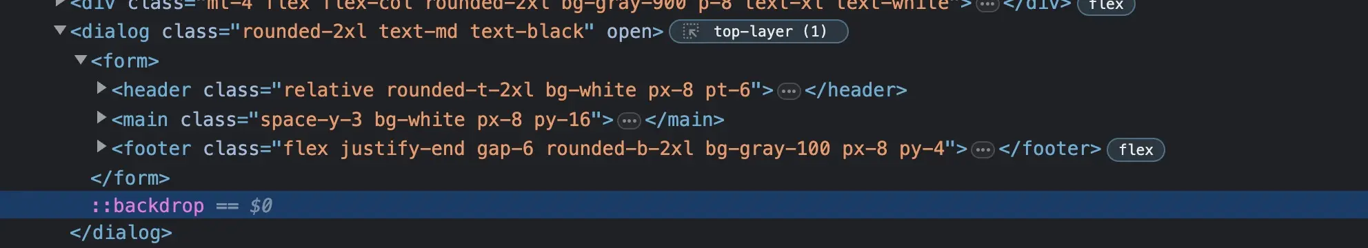
This element can be styled just like any other pseudo element. With Tailwind, it’s even easier.
You can add a single class name, such as background:backdrop-blur-sm, to blur the entire background when the dialog opens.
<dialog ref={dialogRef} className="text-md rounded-2xl text-black backdrop:backdrop-blur-xs"></dialog>Time to unstuck ourselves
Now that we have improved the styles, let’s ensure that the close button is functioning properly.
Perhaps you have already clicked the close button and it seemed like everything worked.
However, what actually happened was that the form was submitting.
This is not what we want to happen when closing a dialog.
Therefore, let’s modify the button so that it has the attribute type="button".
This will prevent it from acting as a submit button, as all buttons inside a form are of type submit by default.
<button type="button" className="absolute right-4 top-4 flex h-8 w-8 items-center justify-center rounded-md bg-gray-100 p-3 text-xl"> <span className="sr-only">close</span> ×</button>That one line already stops the form from submitting. Now lets add one more line to make the button act as a close button.
<button type="button" onClick={() => dialogRef?.current?.close()} className="absolute right-4 top-4 flex h-8 w-8 items-center justify-center rounded-md bg-gray-100 p-3 text-xl"> <span className="sr-only">close</span> ×</button>That line runs the close action on the dialog. And when running that, the browser again is so kind to also move the focus back to the button that opened the dialog. Without us having to do anything. Amazing, isn’t it!
Submitting the form data
If you do want to submit the form though, there’s also really neat trick that the dialog gives us. If you add either method="dialog" onto the form, or formMethod="dialog" onto the submit button, a submission of the form will close the form and send the form’s data to the dialog.
<dialog ref={dialogRef} onSubmit={(ev) => { const formData = new FormData(ev.target as HTMLFormElement); console.log(formData.get("card-number")); }} onClose={(ev) => { const target = ev.target as HTMLDialogElement; console.log(target.returnValue); }}> <form method="dialog"> <header className="relative rounded-t-2xl bg-white px-8 pt-6"> {/* form header */} </header> <main className="space-y-3 bg-white px-8 py-16"> {/* form content .. */} </main> <footer className="flex justify-end gap-6 rounded-b-2xl bg-gray-100 px-8 py-4"> <button className="text-gray-400" formMethod="dialog" value="cancel"> Cancel </button> <button className="rounded-xl bg-blue-500 px-5 py-3 text-white shadow-md transition-colors hover:bg-blue-600" formMethod="dialog" value="submit" > Save changes </button> </footer> </form></dialog>Getting the form data
When submitting the form the dialog closes automatically, and the data can be caught with these two functions on the dialog element.
onSubmit={(ev) => { const formData = new FormData(ev.target as HTMLFormElement); console.log(formData.get("card-number")); }}onClose={(ev) => { const target = ev.target as HTMLDialogElement; console.log(target.returnValue);}}The onSubmit will work the same as a form onSubmit, giving you the form submit event, and thus the option to extract all the data. On top of that
the onClose event will also get called. This will contain the dialog element as the event target. The dialog has a property returnValue
that contains the value of the button that triggered it. So in case of the cancel button that value would be cancel. This value can be useful to determine
the action of the form (has it really been sent or not?).
Adding some animations
Let’s finally add some animations.
Whenever the dialog opens, the browser automatically adds the open attribute to the dialog.
This attribute can be used by us to animate the dialog! However, by default, the browser
toggles between display: none and display: block, which are values that we can’t animate.
So in order to animate the dialog, we first need to set the dialog to always have display: block;.
However, this means that the dialog will always be visible, which we don’t want. To prevent this, we need to add the following styles:
<dialog className="text-md inset-0 block w-2/3 max-w-5xl translate-y-20 rounded-2xl p-0 opacity-0 transition-[opacity,transform] duration-300 backdrop:backdrop-blur-xs [&:not([open])]:pointer-events-none"></dialog>First we make the dialog always display: block, then we hide it by setting opacity-0 and move it 20px to the bottom
by adding translate-y-20. We also add pointer-events-none to make sure the dialog can’t be interacted with when it’s closed.
The &:not([open]) makes sure that the styles are only applied when the dialog is not open.
Finally we also add a transition for the opacity and transform, and set a custom duration.
That leaves us only with adding some styles when the dialog actually is open:
//focus(4)<dialog className="text-md inset-0 block w-2/3 max-w-5xl translate-y-20 rounded-2xl p-0 opacity-0 transition-[opacity,transform] duration-300 backdrop:backdrop-blur-xs [&:not([open])]:pointer-events-none [&[open]]:translate-y-0 [&[open]]:opacity-100"></dialog>This then fades in the dialog, and moves it back to it’s original position ✨.
And by adding this final step, we suddenly have a nice dialog that looks like this:
Billing details
Premium plan
Your plan renews on 01/01/2024
So little effort
It’s amazing how little effort it takes to built a modal like this, that also has so many accessibility features included. The next time you want to use a modal, absolutely use the dialog element. It will save you a lot of time, and make your modal accessible by default.
Check out the final code below, and definitely experiment with the playground at the top of this page. Still unsure about some parts of it? Perhaps watching the video is also worth a shot, since some things are explained more in depth there!
import { useRef } from "react";import "./index.css";import { VisaIcon } from "./visa";
function App() { const dialogRef = useRef<HTMLDialogElement>(null);
return ( <div className="w-5xl mx-auto mt-24 max-w-[90%]"> <h1 className="text-3xl font-medium">Billing details</h1> <div className="mt-4 flex flex-col rounded-2xl bg-gray-900 p-8 text-xl text-white"> <p>Premium plan</p> <p className="text-sm">Your plan renews on 01/01/2024</p>
<div className="mt-4 flex items-center gap-3 self-start rounded-2xl bg-gray-800 px-4 py-8"> <div className="w-20 rounded-xl bg-white px-3 py-1"> <VisaIcon /> </div> <div>•••• •••• •••• 1234</div> <button onClick={() => dialogRef?.current?.showModal()} className="ml-8 rounded-md bg-gray-600 px-4 py-2 text-sm text-white transition-colors hover:bg-gray-700" > Change payment method </button> </div> </div>
<dialog ref={dialogRef} onSubmit={(ev) => { const formData = new FormData(ev.target as HTMLFormElement); console.log(formData.get("card-number")); }} onClick={(ev) => { const target = ev.target as HTMLDialogElement; // This line isn't explained in the article. What it does though is // it checks when the user clicks on the dialog, if the target is the dialog itself. // If that's the case, it will close it, because in that case the user clicked // on the backdrop instead of the header, main or footer withing the dialog. if (target.nodeName === "DIALOG") { target.close(); } }} onClose={(ev) => { const target = ev.target as HTMLDialogElement; console.log(target.returnValue); }} className="text-md inset-0 block w-2/3 translate-y-20 rounded-2xl p-0 opacity-0 transition-[opacity,transform] duration-300 backdrop:backdrop-blur-xs [&:not([open])]:pointer-events-none [&[open]]:translate-y-0 [&[open]]:opacity-100" > <form method="dialog"> <header className="relative rounded-t-2xl bg-white px-8 pt-6"> <h1 className="text-2xl font-bold">Change your payment method</h1> <button type="button" onClick={() => dialogRef?.current?.close()} className="absolute right-4 top-4 flex h-8 w-8 items-center justify-center rounded-md bg-gray-100 p-3 text-xl" > <span className="sr-only">close</span> × </button> </header> <main className="space-y-3 bg-white px-8 py-16"> <div className="flex items-center"> <label className="mr-auto w-1/3 text-gray-400">Card number</label> <input className="w-full rounded-lg border px-3 py-2" type="text" name="card-number" /> </div>
<div className="flex items-center"> <label className="mr-auto w-1/3 text-gray-400">Expiration</label> <input className="w-full rounded-lg border px-3 py-2" type="text" name="expiration" /> </div>
<div className="flex items-center"> <label className="mr-auto w-1/3 text-gray-400">CVC</label> <input className="w-full rounded-lg border px-3 py-2" type="password" name="cvc" placeholder="•••" /> </div> </main> <footer className="flex justify-end gap-6 rounded-b-2xl bg-gray-100 px-8 py-4"> <button className="text-gray-400" formMethod="dialog" value="cancel" > Cancel </button> <button className="rounded-xl bg-blue-500 px-5 py-3 text-white shadow-md transition-colors hover:bg-blue-600" formMethod="dialog" value="submit" > Save changes </button> </footer> </form> </dialog> </div> );}
export default App;