Tutorial
Using CSS Perspective To Create a 3D Card Tilt Animation In Minutes
You don't need any fancy libraries to work with 3D in CSS!
12345678910111213import { ArcCard } from "./arc-card";
import "./index.css";
function App() {
return (
<main className="flex h-screen items-center justify-center bg-gray-900">
<ArcCard name="Jeroen" title="The GOAT 🐐" since="22 Jul 2022" />
</main>
);
}
export default App;
3D in CSS without a fancy library!
There are many libraries out there to create 3D animations. With CSS perspective though, you don’t need to use any of them, and can still create some pretty cool effects. In this article we’ll explore how to use CSS perspective to effortlessly create a 3D card tilt animation.
It all starts with perspective – what is it?
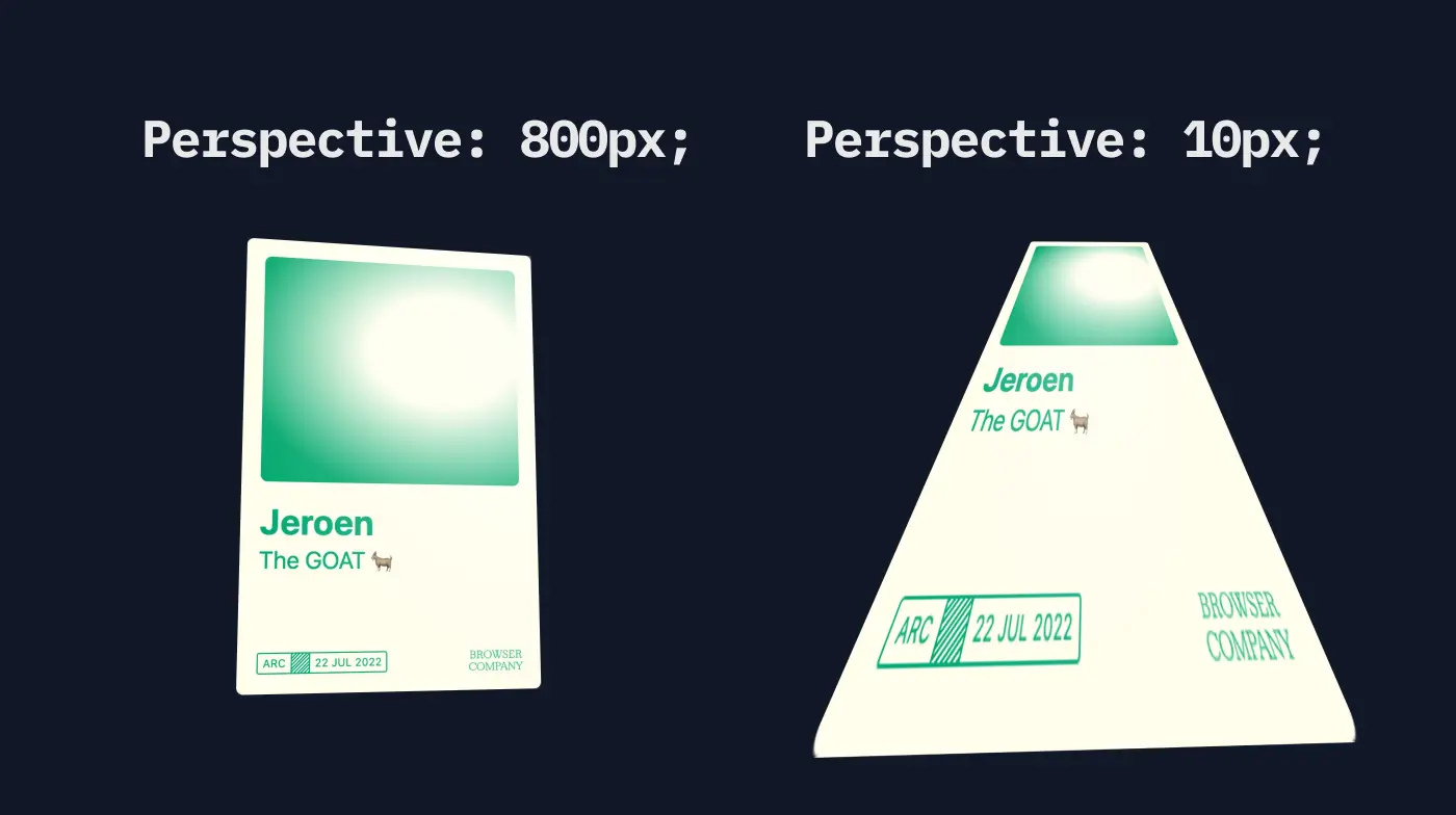
The magic property that unlocks the 3D potential, is perspective. This property determines the distance between the 0 z-index, and the user. Defining this perspective is done in pixels, meaning that if you define perspective: 800px, you define a distance of 800 pixels between the user and z-index 0.
As an example, take a look at the below image. It shows the same card twice, once with a perspective of 800 pixels, and the second time with a perspective of 10 pixels. It results in a very different effect.
Rotating the card in 3D space
Adding only perspective, won’t rotate the card yet. It does give the default CSS rotate additional strengths though. Play around with the different rotations in the example below, to see the effect it has.
transform: rotateX(0deg) rotateY(0deg) rotateZ(0deg);
That’s all there’s to it
Combining perspective with a CSS rotation is literally the only thing you have to do, to enable 3D animations in CSS. In the video shown at the top of this article, as well as in the live playground you find there too, we also add a little bit of JavaScript magic to make this card rotate based on the cursor position. As a final touch we even add a moving gradient that follows your cursor, to make the card pop even more. Definitely watch the video if you haven’t yet!
Eager to learn more?
I think this video might be a good fit for you too!