What Google Does With ThreeJS, We Can Do With CSS ONLY!
In this article we'll be recreating Google's card animation on The Web Showcase website. Google opted for ThreeJS – we're gonna challenge them and build this with plain CSS animations.
... Almost ready!
Working with 3D in CSS has a lot more restrictions than building experiences with libraries like ThreeJS. So I totally get why Google opted for ThreeJS when they set out to build The Web Showcase. But I also think that there’s a lot more we can do with CSS nowadays. And that’s why in this article we’ll be recreating the card animation on the website with plain CSS animations and as little JavaScript as possible.
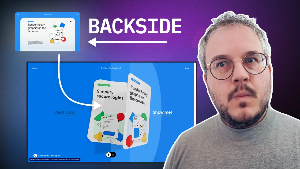
Google’s Example
First let’s take a look at what Google created.
The whole website is filled with many micro animations. So many we can’t recreate them all in one article. We will focus on recreating the hover animation on the cards, as well as the transition to the detail card.
Recreating the hover animation
For recreating the hover animation, there are two big steps we need to take. Firstly I want to trigger the hover with CSS only, and secondly we need to be able to rotate a card on the 3D axis. Let’s start with the hover.
Triggering the hover
We could of course use some JavaScript to change the class over the card on hover. But that would be too easy! We will be learning a few CSS tricks today.
In CSS it is possible to select sibling elements by using the tilde ~ operator. This operator allows us to hover an element, and then style a sibling that comes after it. For that reason we created HTML that looks like the following:
<div> <button class="next">Next Card</button> <button class="show">Show</button> <div class="card">Card Wrapper</div></div>This code, allows us to write CSS to select the card wrapper when we hover the show button. That CSS could look something like:
.show:hover ~ .card { background: red;}If we combine this, we get the following. Hovering the show button will change the background of the card wrapper. This way, we now are able to trigger this hover animation, without the need for JavaScript.
The hover with Tailwind
When using Tailwind, it’s even easier. Tailwind offers the peer class which does exactly what we need. It allows us to select a sibling element.
<div> <button class="next">Next Card</button> <button class="show peer">Show</button> <div class="card peer-hover:bg-red-800">Card Wrapper</div></div>Now with Tailwind, we do run into a small issue. We can only use the peer class once, but we want to make a different hover effect based on which button is hovered. Luckily they though about this, and gave us the option to name the peer classes like so:
<div> <button class="next peer/next">Next Card</button> <button class="show peer/show">Show</button> <div class="card peer-hover/next:bg-blue-800 peer-hover/show:bg-red-800"> Card Wrapper </div></div>Add some 3D
Now we know how we can target the card, it’s time to make it rotate in 3D. By default using CSS transforms, will always transform on the 2D axis. But as soon as you add a perspective property to a parent element, you all of a sudden unlock a whole new world of 3D transforms. Make sure to watch this video on CSS Perspective Animations to get a better understanding on how this works.
Let’s take a look at the example below, to see the effect. Move the rotate sliders, and toggle the perspective on and off, and see what the difference is.
Combining both
Now we know how we can create a hover animation on a sibling, plus can animate in 3D space, it is time to finally bring the two together.
The main challenge in this is coming up with the right 3D transforms an rotates that look good. This is something that really takes time and trial and error, so don’t give up if you don’t get it right the first time.
I ended up creating the following two classes to rotate the card in the correct way.
.card--to-right { transform: rotate3d(1, 12, -3, 18deg) translate3d(210px, 0px, 90px);}.card--to-left { transform: rotate3d(1, 12, -3, -18deg) translate3d(-210px, 0px, 90px);}Because these classnames are added as “component” in Tailwind, we can combine them with our peer classnames like so:
<div class="[perspective:800px]"> <button class="next peer/next">Next Card</button> <button class="show peer/show">Show</button> <div class="card peer-hover/next:card--to-right peer-hover/show:card--to-left flex aspect-2/3 items-center justify-center rounded-2xl bg-gray-300 transition-transform duration-1000" > Card Wrapper </div></div>And look at that – a rotating card on hover, without any JavaScript!
A note on accessibility
Besides hover, it’s important to also apply the animation on focus. For the peer you can use peer-focus-visible or peer-focus-within to trigger the animation. See the implementation in the final result to see how that works.
Adding the detail card
Now we have the hover animation, it’s time to add the detail of the card. When “opening” a specific card, it looks like the content appears on the back side of the card. However, what is actually happening is that at the very last moment when this card is rotated, an extra div becomes visible that has the content of the card. This makes the animation a bit easier to achieve.
We again have two steps to take. First we need to rotate the card 180 degrees, and then we need to add and show a second element with the content.
Rotating the card 180 degrees
Rotating the card 180 degrees is actually pretty easy. We can use the same technique as we did before, but now we need to rotate the card 180 degrees. The most tricky part of this, is having the card end up in the exact position we want it to be. This is again something that takes a lot of trial and error.
If you look at the Tailwind Config file in the playground above, you see I ended up creating 2 CSS animations with transforms for this.
"card-visible": { "0%": { transform: "rotate3d(1, 12, -3, 18deg) translate3d(210px, 0px, 90px)", }, "95%": { transform: "rotate3d(0, 0.2, 0, 180deg) translate3d(0px, calc(150% - 45vh), 0px) scale(3)", }, "100%": { transform: "rotate3d(0, 0.2, 0, 180deg) translate3d(0px, calc(150% - 45vh), 0px) scale(3)", }, }, "card-on-stack": { "0%": { transform: "rotate3d(0, 0.2, 0, 180deg) translate3d(0px, calc(150% - 45vh), 0px) scale(3)", }, "5%": { transform: "rotate3d(0, 0.2, 0, 180deg) translate3d(0px, calc(150% - 45vh), 0px) scale(3)", }, "100%": { transform: "rotate3d(0, 0, 0, 0) translate3d(0, 0px, 0px)", }, },You see two different keyframes, the first one we run when making the card fullscreen, and the second one we run when we close the card.
Card visible animation
- It starts from the same position as the hover. This is important, because we want the card to rotate from the hover position, and not the position where it would still be in the center of the screen.
- Both the steps at 95% and 100% are the same. The reason for this is because at that last 5 percent, the content is actually fading in, and we want the card animation to have finished before that. So we just keep the card in the same position for those last 5%, instead of calculating a different duration for both of the animations.
Card on stack animation
- This time the card starts from it’s fullscreen position and then at 100% animates back to the center position instead of the hover position.
- Also here you notice that we wait the first 5%, which is when the content is fading out, before we start animating the card back to the center.
Running the animation
In the Tailwind Config you notice that we also added two animations to run the above keyframes. This definition gives us two classnames animate-card-visible and animate-card-hidden that we can use to run the animations.
This is the only part where I’ve decided to use JavaScript to set the animation state in the component’s state. Based on this state we’re then adding the correct animation classname, which makes the card fullscreen.
Take a look at this snippet from the playground:
<Card className={twMerge( "peer-hover/next:card--to-left peer-focus-within/next:card--to-left peer-hover/show:card--to-right peer-focus-within/show:card--to-right [grid-area:1/1]", animationState === "opening" && "animate-card-visible", animationState === "closing" && "animate-card-hidden", )} title="Animate so many things with just CSS!"/>Backface visibility
When rotating an element 180 degrees in 3D, you will notice that the backside of the element is visible. This is because the element is now rotated, and the backside is now facing the user. This is not always what you want, and luckily there’s a CSS property to fix this. It’s called backface-visibility and it allows you to hide the backside of an element.
Replacing the card with the content
The final step is also showing the card’s content. We use a similar approach as for rotating the card, to set an animation conditionally, as well as conditionally render the div with the content. By using the 5% delay like explained above, we can now fade in/out this element at the right time.
Conclusion
And that’s it! We recreated a minimal version of Google’s animation. It’s not containing all nice details Google added, but I hope it’s a great start and inspiration to you to see how you can create these types of animations yourself – even in plain CSS.
If you want to see the full implementation, make sure to check out the source code above, and watch the video for even more details.
Eager to learn more?
I think this video might be a good fit for you too!