Tutorial
The ONLY Proper Way to Make Article Layouts With CSS
You can make great layouts with both CSS Grid as well as Flexbox. However, when making article layouts with elements extending beyond the width of the main content, I've been using CSS Grid a lot lately.
123456789101112131415161718192021222324252627282930313233343536373839404142434445464748495051525354555657585960616263646566676869707172737475767778798081828384858687888990919293949596979899100101102103104105106107108109110111112113114115116117118119120121122123124125126127import "./index.css";
function App() {
return (
<main className="min-h-screen bg-gradient-to-r from-[#1B1F1D] to-[#2C3432] pb-12">
<div className="article-grid text-md grid gap-y-4 font-serif leading-relaxed text-white md:gap-y-4 md:text-xl">
<div className="full-bleed h-[500px]">
<img src="/img/css-grid-article/webdev1.webp" className="h-full w-full object-cover" />
</div>
<h1 className="wide-bleed mb-8 text-2xl md:text-5xl">
From Webmasters to Web Wonders: The Hilarious Evolution of Frontend
Development
</h1>
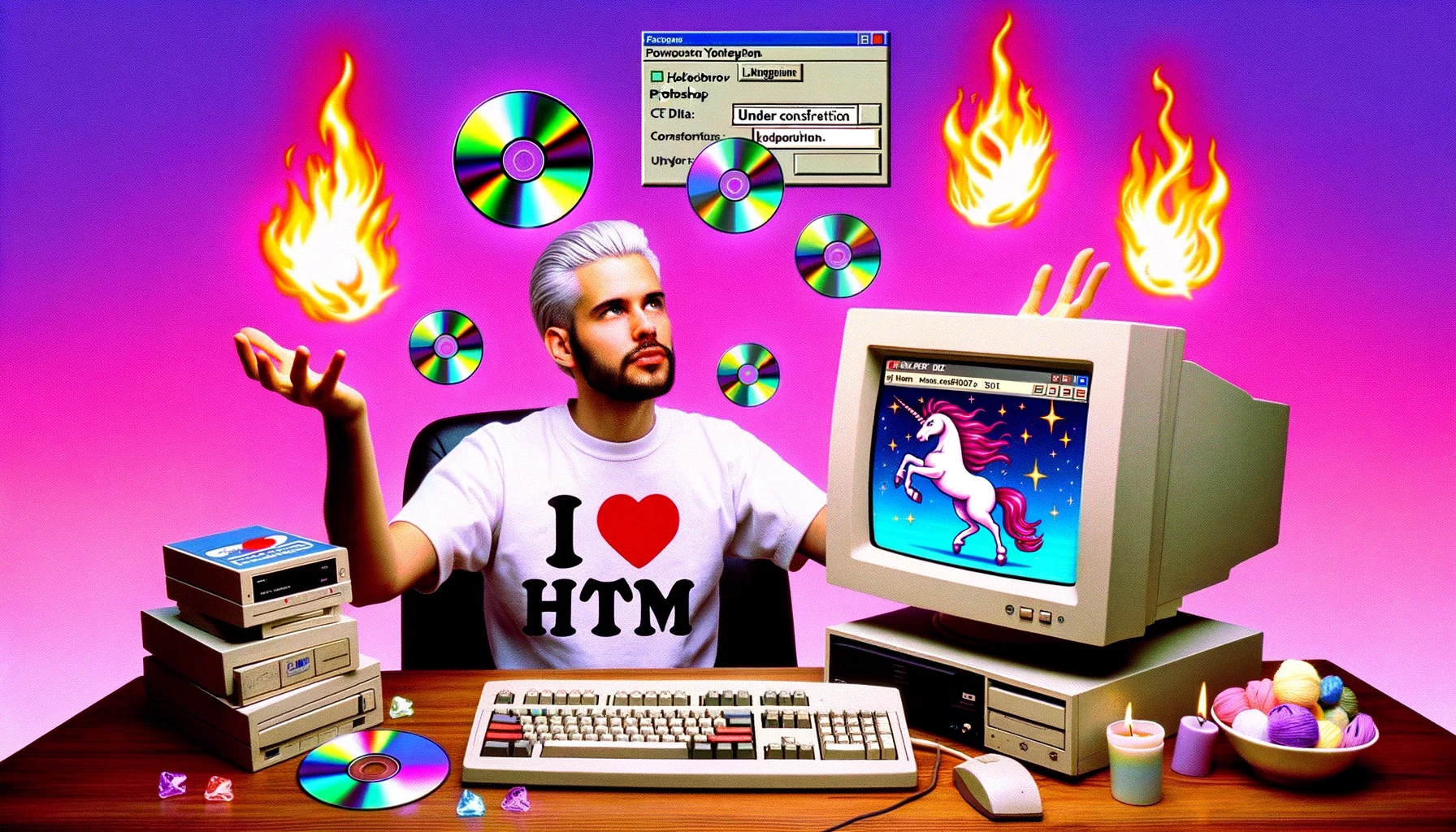
<p>
In the misty days of yore, when the internet was still a fresh-faced
newcomer to the world, there existed a mythical creature known as the
"Webmaster." Legend tells that this Webmaster was a lone ranger, doing
everything from crafting pixel-perfect designs to managing server
hiccups. The Webmaster was often seen sporting an oversized 'I ♥
HTML' t-shirt, using a dial-up connection, and juggling flaming CDs of
early Photoshop versions. Oh, and let's not forget the critical task
of selecting the right animated GIFs for their website. Sparkling
unicorns? Why not!
</p>
<p>
Back then, websites were simpler – a sprinkle of HTML here, a dash of
CSS there, and voilà! Instant online masterpiece. And when something
needed to be uploaded? Ah, enter the humble FTP – File Transfer
Protocol. A Webmaster's trusty steed. Forget Vercel, Netlify, or any
CI/CD pipelines. A few drags, a few drops, and your website was live
for all 12 users on the internet to see.
</p>
<div className="wide-bleed grid gap-4 md:grid-cols-2 md:grid-rows-2">
<img className="rounded-md object-cover" src="/img/css-grid-article/webdev2.webp" />
<img className="rounded-md object-cover" src="/img/css-grid-article/webdev3.webp" />
<img className="rounded-md object-cover" src="/img/css-grid-article/webdev4.webp" />
<img className="rounded-md object-cover" src="/img/css-grid-article/webdev5.webp" />
</div>
<p className="my-7 text-3xl italic">
But, as with all legends, times changed.
</p>
<p>
The world grew, and the internet expanded faster than the Webmaster's
collection of "Under Construction" GIFs. With this growth came a level
of professionalism and, dare we say, complication. Webmasters evolved,
diversified, and specialized. Our lone ranger was no longer alone.
</p>
<p>
Enter Frontend Developers, the evolved form of the once solitary
Webmaster. Now, they weren't just designing sites. They were
architecting experiences. No longer was it sufficient to know just
HTML and CSS; now there was JavaScript, and then jQuery (because who
wanted to write raw JavaScript?). But wait! jQuery wasn't enough. The
realm needed more - and thus frameworks like Angular, React, and Vue
descended upon us.
</p>
<p>
And libraries? Oh boy. There was one for everything. Need to handle
dates? Moment.js. Animations? GreenSock. The list was endless. And
while it was all powerful and magical, the Frontend Developer's
backpack was getting heavier and heavier.
</p>
<p>
Yet, with great power came... you guessed it, even more
responsibility. Responsiveness, accessibility, performance, user
experience. It wasn't just about putting a website out there anymore;
it was about crafting digital symphonies. The frontline of user
interaction. And with that intensity? Burnouts. Because being the
guardian of user experience, while keeping up with the latest npm
packages, was no child's play.
</p>
<p>
The internet, with its vast and rapidly evolving ecosystem, was both a
blessing and a beast. Tools like Vercel made deploying a breeze
(seriously, one command and boom – deployed), but they also added
layers of complexity. The lines of 'just' frontend began blurring. Was
it just UI? Or was it understanding serverless functions, third-party
integrations, and API optimizations too?
</p>
<div className="">
<img src="/img/css-grid-article/webdev6.webp" className="w-full rounded-md object-cover" />
</div>
<p>Yet amidst this chaotic crescendo, a realization dawned.</p>
<p>
Every era of the web, from the Webmaster to the modern Frontend
Developer, was a testament to human adaptability and passion. It
wasn't about how complex the tools were or how vast the libraries
became. It was about the joy of creation, the thrill of
problem-solving, and the pride in crafting experiences for users
worldwide.
</p>
<p>
To the world, it might look like a mix of brackets and jargon. But for
those in the trenches, it's art. It's the challenge. And it's the
ever-evolving dance between functionality and beauty.
</p>
<p>
So, whether you're still cherishing the memories of FTP uploads or
navigating the sea of modern frontend frameworks, remember: the heart
of development remains unchanged. It's about the journey, the
community, and the joy of bringing visions to life. And hey, if all
else fails, there's always a place for a sparkling unicorn GIF on the
web.
</p>
<p className="text-2xl italic md:text-5xl">The end.</p>
</div>
</main>
);
}
export default App;
During my career I’ve made quite some article layouts. Layouts where the text is centered, and different types of components are stacked on top of each other, forming a nice article.
It wasn’t an exception when the designer came up with a component that was halfway in the article, that extended beyond the width of the main content. It looked a bit like this.
All content is centered, except a single element
You notice that all elements are centered on the page. But of course the designer thought it looked nice if that big image extends the full width of the page!
Centering the page’s content is often done by adding a wrapper around the content, and center the wrapper by using margin: 0 auto;. However, if you then want to have content break out of thet wrapper, you have a challenge.
How I used to solve that challenge
There are two ways to have the content grow outside its parent container. The first option is to work with multiple wrappers, and have the large image not wrapped inside the container. This is not a perfect solution, because this doesn’t work well if you generate all these different components based on content added in a CMS for example.
So most of the time I went for the second option.
.wrapper { max-width: 800px; margin: 0 auto;}
.large-image { width: 100vw; left: 50%; transform: translateX(-50%);}This solution makes the image as wide as the screen, and by combining left and translateX, we pull it to the far left side of the screen, outside of the wrapper.
It can be a bit finicky to get to work though. Plus using 100vw could result in unwanted scrollbars. So despite the fact that this solution works, it still brought its challenges.
The CSS Grid solution
Luckily CSS Grid has evolved a lot lately. And what better use of CSS Grid, than building a grid, right? So let’s take a look at how we can create a similar result, but with CSS Grid and without the downsides.
Replacing the wrapper with a grid container
We’ll be using the following HTML to create the grid. This is a snippet from the live playground above, which is a far more extensive example.
<main> <div class="container space-y-3"> <h1 class="text-2xl">From Webmasters to Web Wonders</h1> <p>In the misty days of yore, when the internet was still a fresh-faced newcomer to the world, there existed a mythical creature known as the "Webmaster." Legend tells that this Webmaster was a lone ranger, doing everything from crafting pixel-perfect designs to managing server hiccups. The Webmaster was often seen sporting an oversized 'I ♥ HTML' t-shirt, using a dial-up connection, and juggling flaming CDs of early Photoshop versions. Oh, and let's not forget the critical task of selecting the right animated GIFs for their website. Sparkling unicorns? Why not!</p> <img src="https://sandpack-frontendfyi.vercel.app/img/css-grid-article/webdev1.webp" /> <p>Back then, websites were simpler – a sprinkle of HTML here, a dash of CSS there, and voilà! Instant online masterpiece. And when something needed to be uploaded? Ah, enter the humble FTP – File Transfer Protocol. A Webmaster's trusty steed. Forget Vercel, Netlify, or any CI/CD pipelines. A few drags, a few drops, and your website was live for all 12 users on the internet to see.</p> </div></main>The space-y-3 tailwind class is only added to add some vertical spacing between the elements. This basic example would simply have the content extend to the edges of the page.
From Webmasters to Web Wonders
In the misty days of yore, when the internet was still a fresh-faced newcomer to the world, there existed a mythical creature known as the "Webmaster." Legend tells that this Webmaster was a lone ranger, doing everything from crafting pixel-perfect designs to managing server hiccups. The Webmaster was often seen sporting an oversized 'I ♥ HTML' t-shirt, using a dial-up connection, and juggling flaming CDs of early Photoshop versions. Oh, and let's not forget the critical task of selecting the right animated GIFs for their website. Sparkling unicorns? Why not!
Back then, websites were simpler – a sprinkle of HTML here, a dash of CSS there, and voilà! Instant online masterpiece. And when something needed to be uploaded? Ah, enter the humble FTP – File Transfer Protocol. A Webmaster's trusty steed. Forget Vercel, Netlify, or any CI/CD pipelines. A few drags, a few drops, and your website was live for all 12 users on the internet to see.
The first step is to make our container display grid, as well as define a grid layout.
.container { display: grid; grid-template-columns: 1fr [content-start] 720px [content-end] 1fr;}By doing this, we are defining a grid layout with 3 columns. In the center is a column that’s always 720 pixels wide, and then two equal parts on either side.
We also gave the center column a name called content. The -start and -end suffixes are CSS Grid standards, via which you can define grid colums based on their edges rather than their center.
For the center column this might not seem very logical, but as soon as we add a second named column that wraps the content column, it probably does:
.container { display: grid; grid-template-columns: [full-start] 1fr [content-start] 720px [content-end] 1fr [full-end]}By now defining the start and end of the full column too, we have two name slots that we can use to place our content in. We place the content by using the colum names full or content.
The first step is making a default, to center all content like we did in the previous example as well. We can approach it like this.
.container { display: grid; grid-template-columns: [full-start] 1fr [content-start] 720px [content-end] 1fr [full-end];}
.container > * { grid-column: content;}With this CSS we target every direct child of the container, and place it in the content column. That column is defined by the -start- and -end marks.
If we would render that, it would look like this (the example below uses 50% for the content instead of 720px, because the content column of this blog already is quite narrow).
From Webmasters to Web Wonders
In the misty days of yore, when the internet was still a fresh-faced newcomer to the world, there existed a mythical creature known as the "Webmaster." Legend tells that this Webmaster was a lone ranger, doing everything from crafting pixel-perfect designs to managing server hiccups. The Webmaster was often seen sporting an oversized 'I ♥ HTML' t-shirt, using a dial-up connection, and juggling flaming CDs of early Photoshop versions. Oh, and let's not forget the critical task of selecting the right animated GIFs for their website. Sparkling unicorns? Why not!
Back then, websites were simpler – a sprinkle of HTML here, a dash of CSS there, and voilà! Instant online masterpiece. And when something needed to be uploaded? Ah, enter the humble FTP – File Transfer Protocol. A Webmaster's trusty steed. Forget Vercel, Netlify, or any CI/CD pipelines. A few drags, a few drops, and your website was live for all 12 users on the internet to see.
By placing all children of the container inside the content column, we suddenly replicated the centered content! But we won’t stop there. We added a full column as well! How would we add that?
.container { display: grid; grid-template-columns: [full-start] 1fr [content-start] 720px [content-end] 1fr [full-end];}
.container > * { grid-column: content;}
.container > .full-bleed { grid-column: full;}We define a helper class called for example full-bleed, to which we assign the full grid colum. If we would add that class to the image, we suddenly have an image that extends the full width!
From Webmasters to Web Wonders
In the misty days of yore, when the internet was still a fresh-faced newcomer to the world, there existed a mythical creature known as the "Webmaster." Legend tells that this Webmaster was a lone ranger, doing everything from crafting pixel-perfect designs to managing server hiccups. The Webmaster was often seen sporting an oversized 'I ♥ HTML' t-shirt, using a dial-up connection, and juggling flaming CDs of early Photoshop versions. Oh, and let's not forget the critical task of selecting the right animated GIFs for their website. Sparkling unicorns? Why not!
Back then, websites were simpler – a sprinkle of HTML here, a dash of CSS there, and voilà! Instant online masterpiece. And when something needed to be uploaded? Ah, enter the humble FTP – File Transfer Protocol. A Webmaster's trusty steed. Forget Vercel, Netlify, or any CI/CD pipelines. A few drags, a few drops, and your website was live for all 12 users on the internet to see.
That’s literally all there is to position elements outside of the container. That’s so much simpler compared to the non-css grid solution.
Adding more columns
It also doesn’t end here, you could add as many extra columns as you like. You could for example add a wide column too.
.container { display: grid; grid-template-columns: [full-start] 1fr [wide-start] 140px [content-start] 720px [content-end] 140px [wide-end] 1fr [full-end];}This then adds a third named column that adds 140 pixels on both sides of the main content.
How would we make this responsive?
The final step is also getting this to work on mobile. It’s easier than you might think!
@media screen and (max-width: 1000px) { .container { display: grid; grid-template-columns: 18px 1fr 18px; grid-template-areas: ". content ." "full full full" ". wide ."; }}Here you see we define grid-template-columns and grid-template-areas separately. By doing this, we can put the named columns unerneath each other, rather than next to each other.
First we’ve added 18 pixels of gap on either side, and the rest of the space is then used for the content. We do this for all rows, except the full content row, which expands into the 18 pixels too.
What about the dots?
The dots are names as well. They are named slots we’re not interested in (we don’t want to use them), and a convention in CSS is then to use a ”.” to indicate those slots are unused. You could also name them empty for example.
Summary
By defining these named columns in CSS Grid, we are able to render elements outside of the main grid, without using negative offsets. This makes it a lot easier to create article layouts, and it’s also a lot more flexible.
.container { display: grid; grid-template-columns: [full-start] 1fr [wide-start] 140px [content-start] 720px [content-end] 140px [wide-end] 1fr [full-end];}
.container > * { grid-column: content;}
.container > .wide-bleed { grid-column: wide;}
.container > .full-bleed { grid-column: full;}
@media screen and (max-width: 1000px) { .container { display: grid; grid-template-columns: 18px 1fr 18px; grid-template-areas: ". content ." "full full full" ". wide ."; }}Want to know more?
Make sure to watch to video, where I go even more into detail about making article layouts with CSS Grid.